You might be thinking to yourself, what is the difference between one white paint from another? Well, it might not seem like a big difference, but I am here to make sure you choose the right one for your home. Paints have different undertones and different textures, so let’s dive into some favorites of mine.
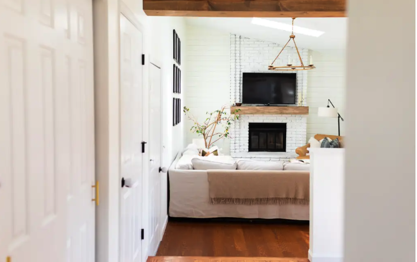
Photo Credit Full Hearted Home
Benjamin Moore Simply White
This color was actually the color of the year in 2016, and I can see why, as it has been used by several interior designers and seen in several home publications. This color has an almost yellow undertone that really brightens up a room. It brings a modern look to a classic color that warms up a space and illudes to opening up a floor plan. This color is best utilized on accent walls, cabinetry, trim, and ceilings.
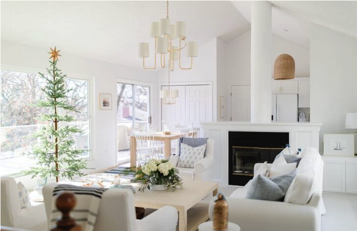
Photo Credit Julie Blanner
Benjamin Moore Chantilly Lace
This white is much crisper with subtle yellow undertones. However, it might be warm, but the undertones are minimal as this color represents pure white. Because of this effect, this white has an extremely neutral beauty to it and amazing brightening features. I love how this color looks in kitchens because it helps illuminate other features without overpowering them.
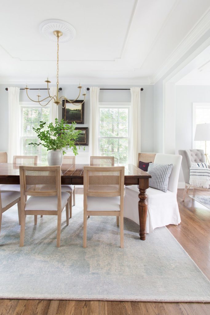
Photo Credit Amelia Lawrence Style & Design
Benjamin Moore White Dove
White Dove has been a favorite among homeowners and designers for a while because of its versatility. This color has cream grayish undertones that have a luminescent finish when applied. It’s known for reflecting light beautifully, so it is a great option for spaces that have natural light flowing in. It has no yellow undertones, so it’s a bit cooler but has a soft, calming effect.
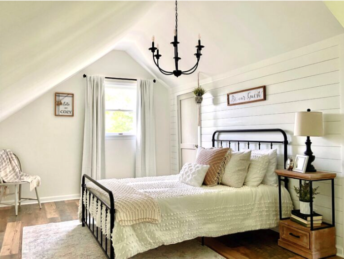
Photo Credit The Charming Daffodil
Sherwin Williams Alabaster
This is an off-white color that has warmer undertones. Alabaster has a soft neutral tone to it that makes a space feel warm and inviting. Still sticking to a classic white, this color has different lighting appearances but enough color for the perfect amount of white to show up every time. I prefer using this color in bedrooms that have a neutral, calming aesthetic.
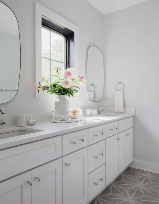
Photo Credit Home Bunch
Sherwin Williams Extra White
This color has subtle blue undertones that give the paint a cooler look, especially when paired next to other cool colors. Although the name is extra, this color is not overpowering. It gives the feeling of that classic white color but blends extremely well into a design. I think this is a great option for bathrooms, offices, and staircases.
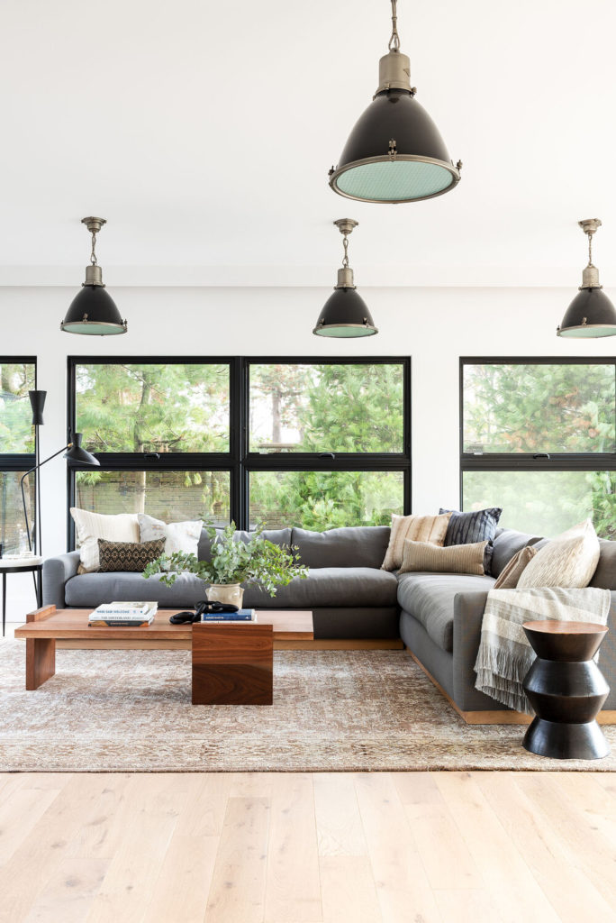
Photo Credit Studio McGee
Sherwin Williams White Flour
This last color almost falls into the light brown spectrum, stunning finish. It has a clean reflection in natural lighting and gives a space a very inviting feel. Personally, I think when used in an open floor plan, this color is great at giving a more cozy feel to a home. The creaminess is perfect for creating a minimal, inviting look.
I hope I was able to narrow down your white paint search and lend some tips on what colors look best in each room! If you want to see some swatches of each paint next to each other, you can see that here. Let me know in the comments which color was your favorite.