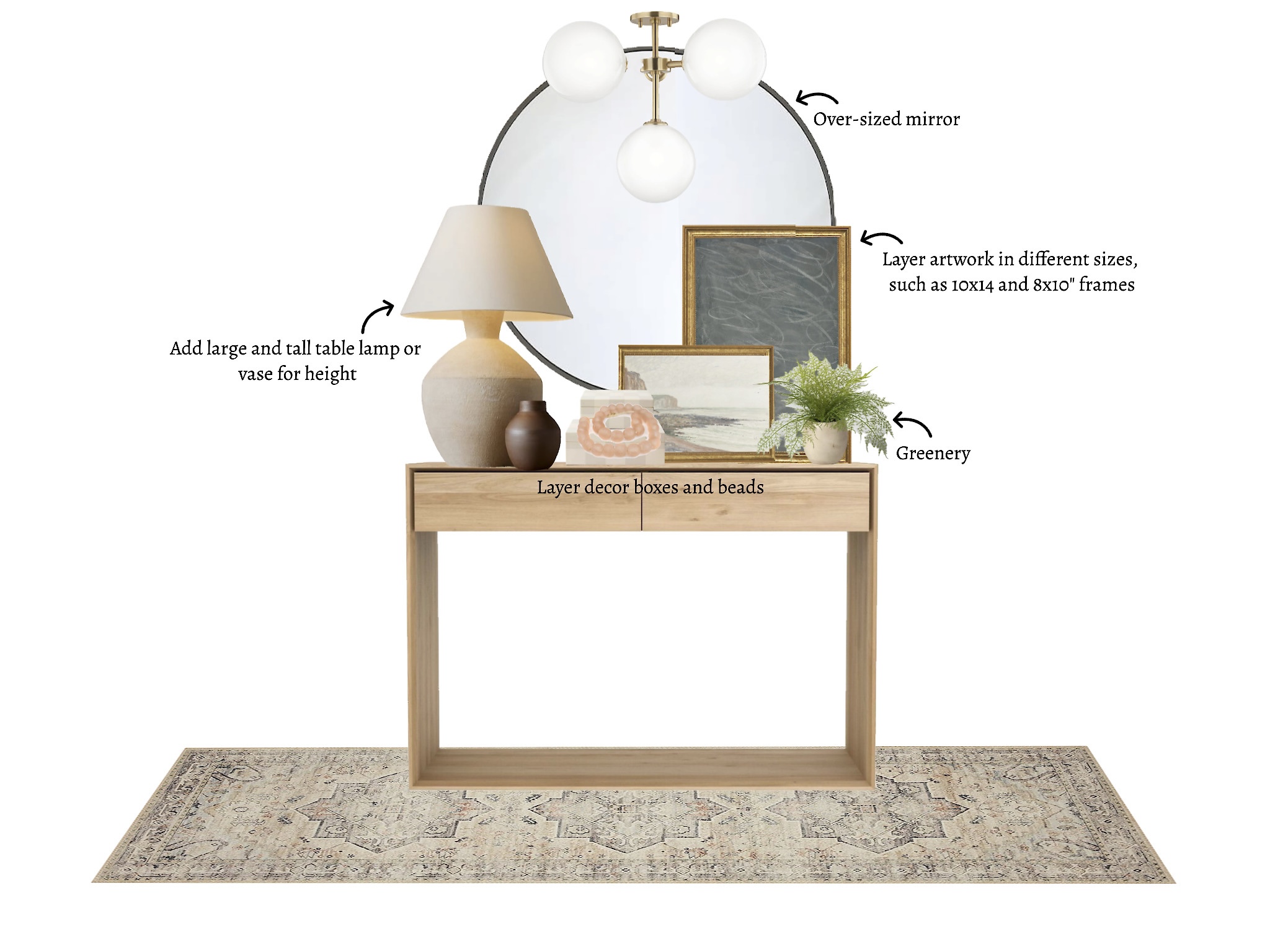
Do you struggle with styling your entryway? Not knowing how much (or how little) to display, or even what to use? In today’s post, I’m breaking it down to one easy formula and sharing how to style an entryway table:
Table Lamp
You always want to add lighting to a space, so it feels bright and open, especially in your home’s entryway. Adding an oversized lamp to this space will bring a lot of dimension decor-wise but also provide the lighting you need. I am a fan of these Form Studies Ceramic Table Lamps because of the dramatic finials. The overhead lighting can also add some character, such as this 4 Light Semi Flush. It mimics the design of a small chandelier but is also very chic and fitting for the space. If you already have great lighting in your entryway, consider adding an oversized vase. These work great for umbrella storage by the front door as well.
Layering of Decor and Photos
Layer, layer, layer. I cannot stress this enough; layering decor pieces is an essential step all interior designers follow to accomplish a finished look. This is your home, so it’s great to add some family photos in the entryway to make it feel homey. I love these big & small Checkered Resign Boxes layered on top of each other with these Jumbo Recycled Glass Beads dangling off the top. Adding some layered art with the photos is also a great way to keep your aesthetic and make your entryway designer.
Greenery
Adding greenery to your home is an excellent addition to keeping your space light. Greenery makes a home feel inviting, allowing the inside to flow smoothly to the outside. A simple touch in your entryway, such as a tiny little fern on your entryway table, makes a world of difference. I love plants, so I would sneak some green in where I could and try different colored plants.
Large Oversized Art or Mirror
The entryway usually isn’t the largest space in a home, but we want it to feel very open to flow into the rest of the foyer. Adding a large entryway mirror is a great way to fill negative space on the walls and not take up valuable space on the ground. Incorporating different shapes is great for creating easy contrast, like this Metal Framed Oversized Round Mirror. When combining wall art, try and mix and match different sized frames to balance out the mirror. These Blue Notes and Normandy Cliffs are subtle colors that look amazing together.
Rug/Runner
I always say a rug will be the finishing touch when designing a space. I love how rugs connect all the dots in a design from top to bottom. Not to mention, a rug by the entryway of your home will also help catch all the dirt on your shoes coming inside. Because of this, I suggest a rug that isn’t too light and has a more neutral intricate design. This Loloi Hathaway Collection Ivory Rug has a beautiful design where the colors seemingly melt together.
I hope you were able to draw some helpful tips for assembling the right pieces in the entryway of your home! If you liked any of the pieces I used, check them out here:
