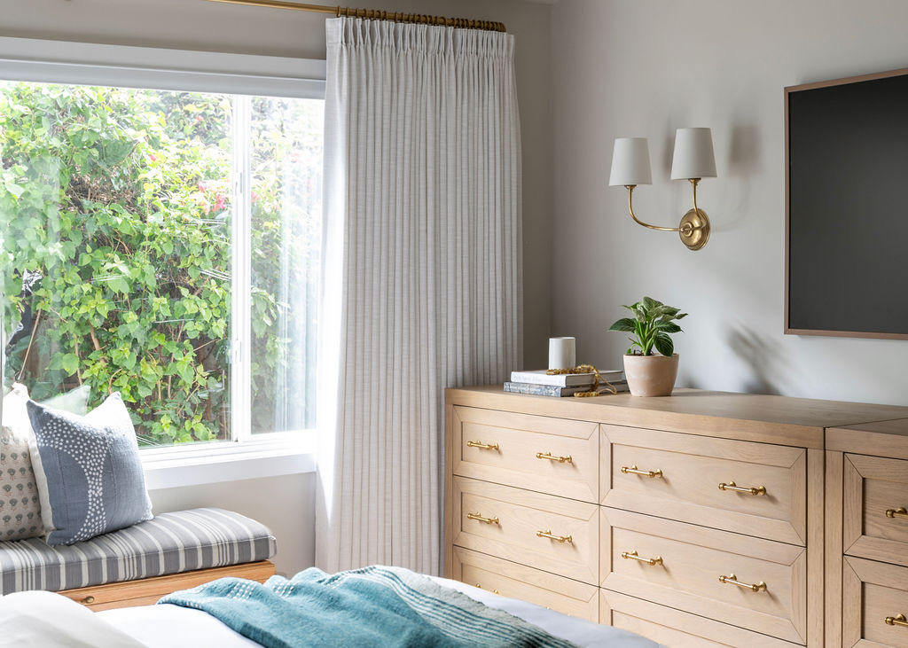
All of Jennifer’s favorite shades of white, all in one place.
I can tell you over and over again, clients seem to have the hardest time with choosing a white. Here are my top 5 paint colors that are tried and true – and to help you feel less overwhelmed with the decision making process. I always stick to warm whites because anything that has bluer, cooler undertones, tends to feel like a doctors office with flourescent lighting, which makes you feel stressed without you even realizing it.
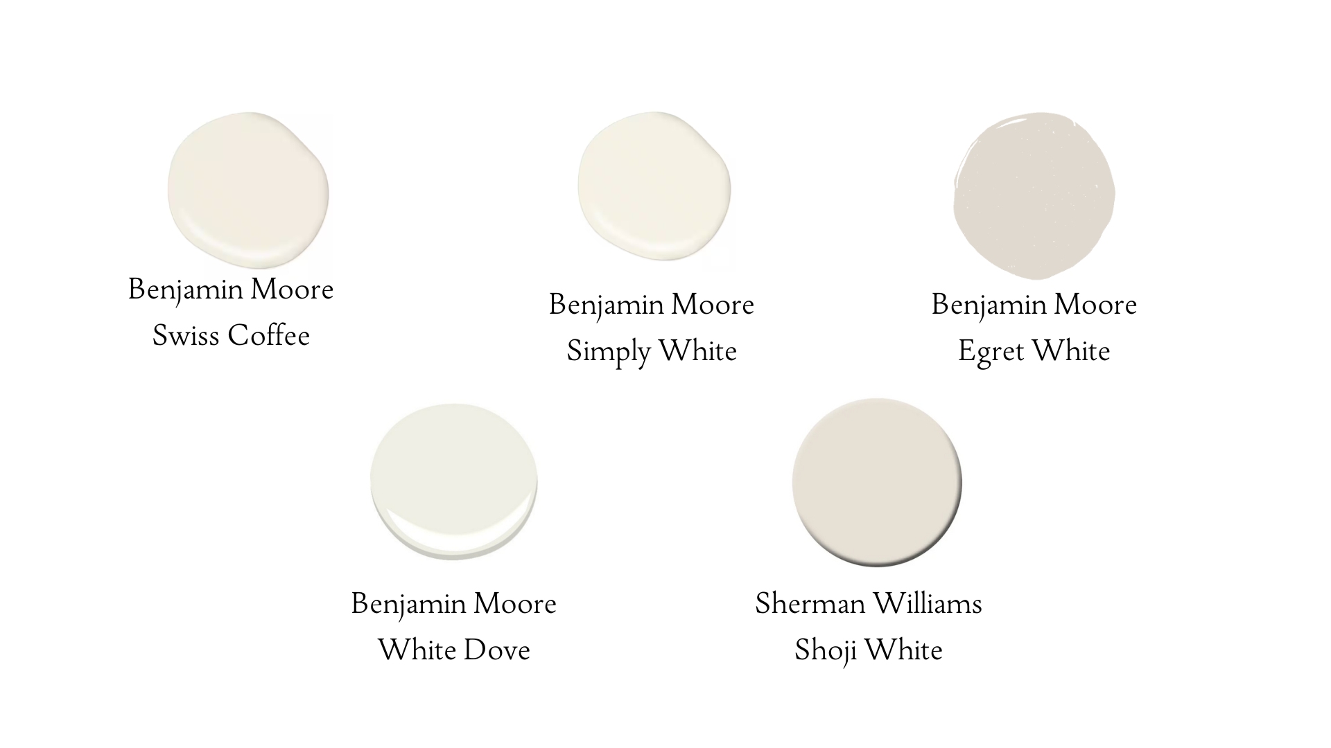
Here is the lineup:
-
Swiss Coffee – Wins Every. Single. Time.
-
White Dove
-
Egret White
-
Simply White
-
Shoji White
PRO TIP: If your walls are white, it’s generally recommended to continue the same color on the ceiling for visual continuity (in a flat/matte finish).
Now, let’s dive deeper:
Benjamin Moore, Swiss Coffee
It’s an essential white with just the right amount of warmth. It adds depth without making the space feel too yellow. It feels warm and airy! It’s versatile and works well in many different styles and lighting conditions and can be used on the interior and exterior of a home.
It is also extremely versatile and can be used for kitchen cabinets, and works well with natural woods and organic materials.
Benjamin Moore, White Dove
“White Dove” paint, by Benjamin Moore, is widely loved because it’s considered a very versatile, “just right” white with a subtle balance of warm and cool undertones. It’s suitable for a variety of spaces and color palettes without appearing too stark or overly creamy, which is why many designers and homeowners frequently choose it; it’s a classic, clean white that can work on walls, trim, and even cabinetry without feeling too cold or too yellow.
Benjamin Moore, Egret White
Sherwin Williams Egret White is a pale neutral, perfect for interior spaces. Since neutrals are notoriously hard to nail down, today’s post is all about deciding if this light tone is right for your space. I painted my Bronxville interior design studio with Egret White! Taupe undertones tend to either be pink or purple or a blend of the two. So, be sure to swatch it to ensure it’s your jam.
Benjamin Moore, Simply White
You would think by the name of it that it would be really white, but it is not. With the high light reflectance value, this white appears warmer than pure white. It has a subtle yellow undertone that gives it an inviting glow! It can be great for painting walls, ceilings and trim, all the same color. It’s bright enough for ceilings but also rich enough to give depth to white cabinets. It’s also great for highlighting art in hallways. It also helps that it was Benjamin Moore’s 2016 Color of the Year!
Sherman Williams, Shoji White
Now this one is a favorite but sometimes at first brushtroke, clients initially freak out at being too yellow on its own. But once furniture and art are in, it’s the most creamy off-white. Shoji White is a creamy off-white with a hint of beige. It has an LRV of 74, which means it’s not too bright or too dark. However, the actual color may vary from how it appears on-screen, so it’s recommended to view a physical color sample before purchasing. Shoji White is a beautiful blend of cream and beige, making it a warm paint color. I’d call it cozy and laid-back.
PRO TIP: Always, always swatch at least 3 paint colors with the small paint can samples from the paint store before committing to the gallon sizes! You will waste time, effort and money by just “winging it”. Every paint color, including whites, will look different in every space depending on the lighting, time of day, color of furniture, floors and bulbs. Do yourself a favor and take your time with paint colors. Paint at least a 3×3′ square on each wall – all walls. Examine them at different times of the day. Lights on, lights off.